


Elevating luxury e-commerce through thoughtful design
My role : UX/UI designer
Project type : E-commerce
Team : 4 UX/UI designer students
Status : MVP phase, not launched
Tools : Figma, Canva
Project overview
Background : WimmerbyTenn is a Swedish tin craft company based in Vimmerby. WimmerbyTenn is known for creating timeless tin crafts from various artists. They have also created crafts for Svenskt Tenn, a famous Swedish interior design company.
Problem : Key UX issues included confusing navigation and missing product info, leaving users uncertain and less likely to buy. The lack of a premium feel also weakened the brand and lowered perceived product value.
Solution : We improved the navigation with a clear menu and engaging item previews to boost exploration. A premium feel was achieved through large visuals and natural tones. Social media images reinforced brand identity, while detailed product info and vertical image scroll enhanced clarity without clutter.
The challenge
Confusing navigation hindered product discovery, lowering conversions.
Unclear product information created buyer uncertainty.
Ambiguous shopping cart caused hesitation and abandoned purchases.
Lack of luxury feel weakened brand positioning and willingness to pay.
Selection of old design


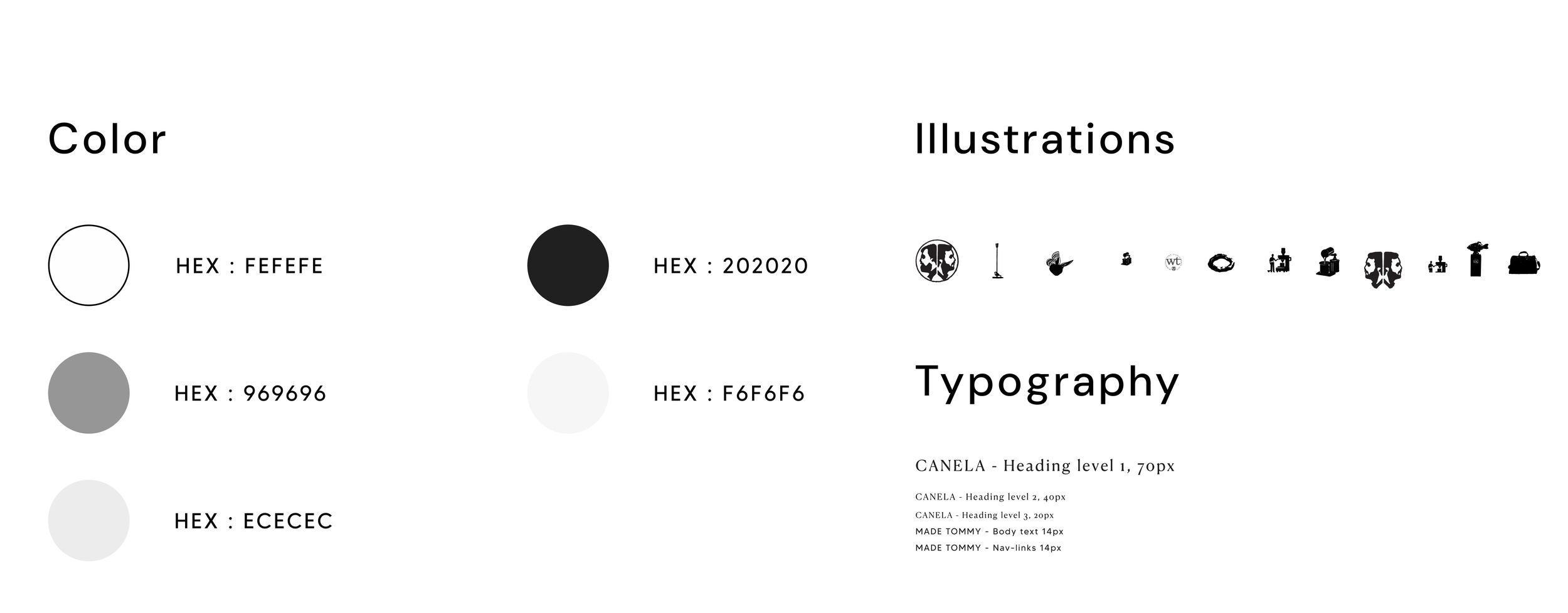
Visual identity
The visual identity was intentionally kept neutral to let the imagery take center stage. This approach was chosen to create a harmonious yet inviting feel. It also aligned with the client’s preference for a more subtle visual tone.
Design process
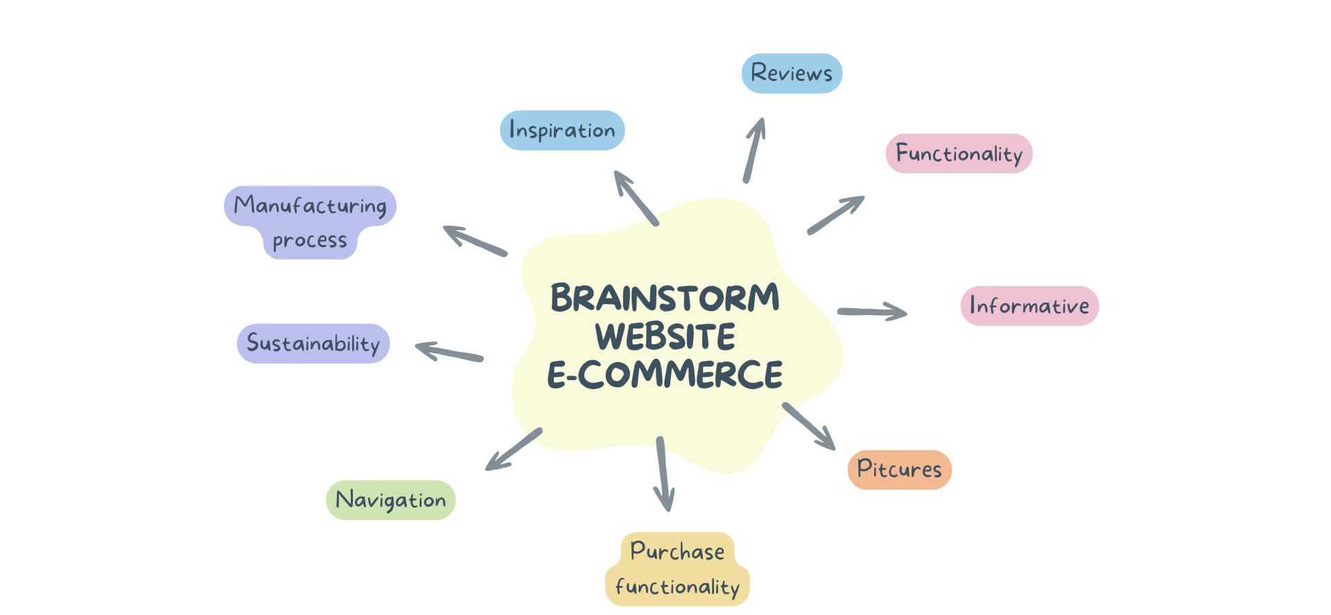
Brainstorm
To address the design problems, we first made a brainstorm to identify and prioritize the most important aspects.
Gathering inspiration
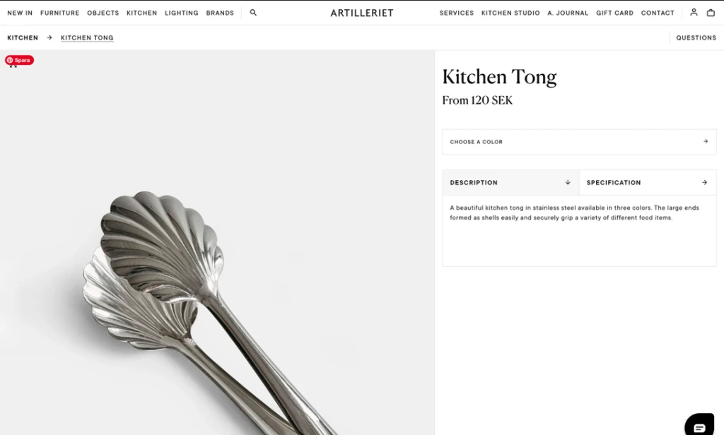
Secondly, we searched for inspiration to spark our creativity. We looked for similar websites that sold home decor.

Menu: Lots of white space (easy to scan) and selling pictures (increase user engagement)

Product page: Minimalistic with ample space for images

Wireframes
After looking for inspiration, we created wireframes to generate ideas and explore various interface possibilities.

To assess whether our design was understandable to users, we conducted a formative test.
They found that the local menu on product page had too many categories (see the image with the red mark below).
Appreciated the ample space for product information and space for images (see the image with the green mark below).
Formative testing with users


Requirement list
Later on, a requirements list was created for the desired functionality of the website. This list was generated following discussions with the client, incorporating both the client's requested features and our own suggestions for functionality.
⚙️ General functionality
Search function
Global navigation (text + image)
Local navigation (text)
System notifications (item in cart)
Book a visit to the store showroom
🛒 Purchase process
Add product to cart
Fill in personal details at checkout
Fill in delivery details at checkout
Apply a discount code
Choose a payment method
Choose gift wrapping
Select gift delivery
⭐️ Reviews
Leave star ratings
Fill in fields to leave a review comment
Read reviews
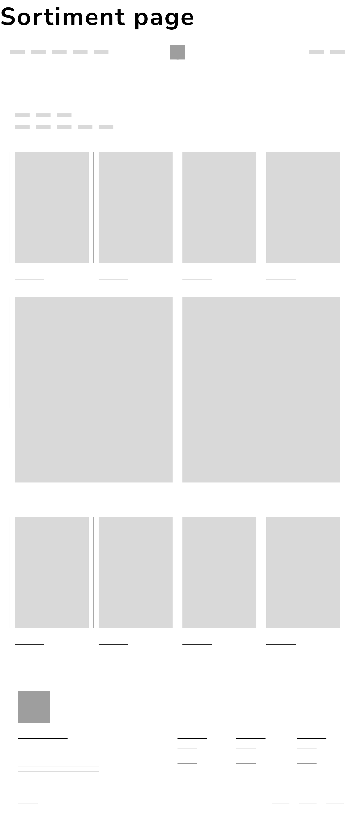
🛍 Product range page
Save function
Filtering
View product in contextual image
Identify if the product is new
Result
Lastly, we created a prototype of the intended interface and layout in Figma.
Navigation
Clear global menu with multiple subcategories.
Added item pictures to the right to engage users in browsing more items.
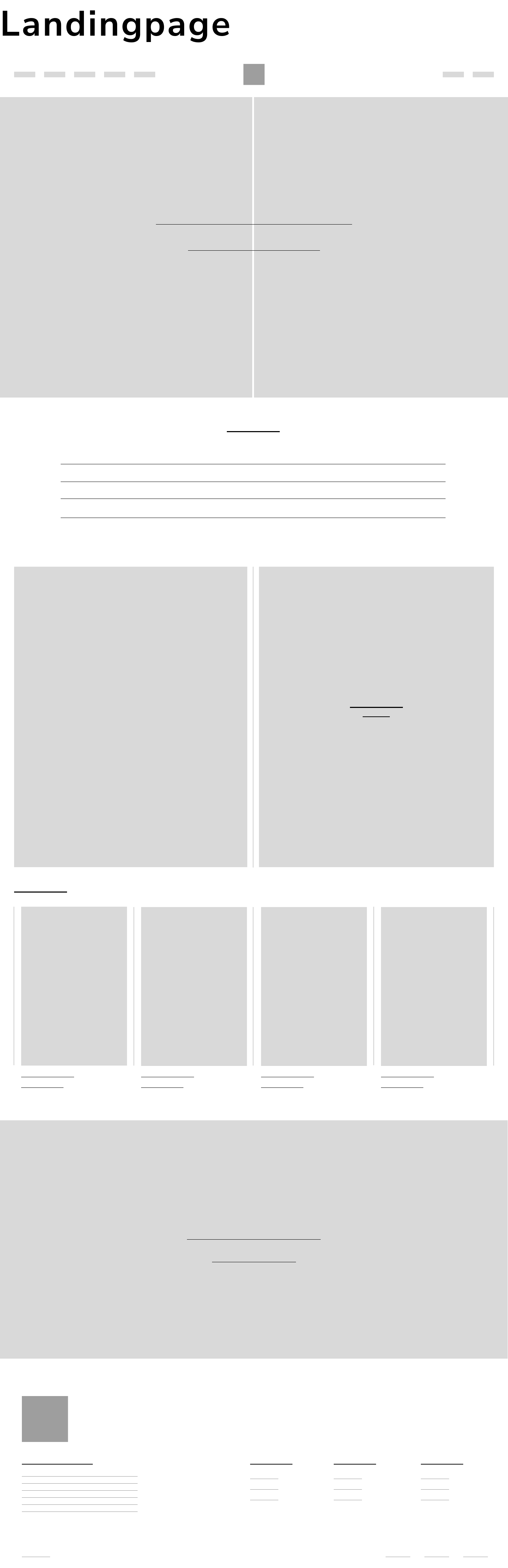
Landingpage
Lifestyle imagery from brand library to strengthen visual identity.
Seasonal product highlights to drive conversions.
Showroom booking info to connect digital and physical retail
Founder portraits with personal copy to build trust and warmth.
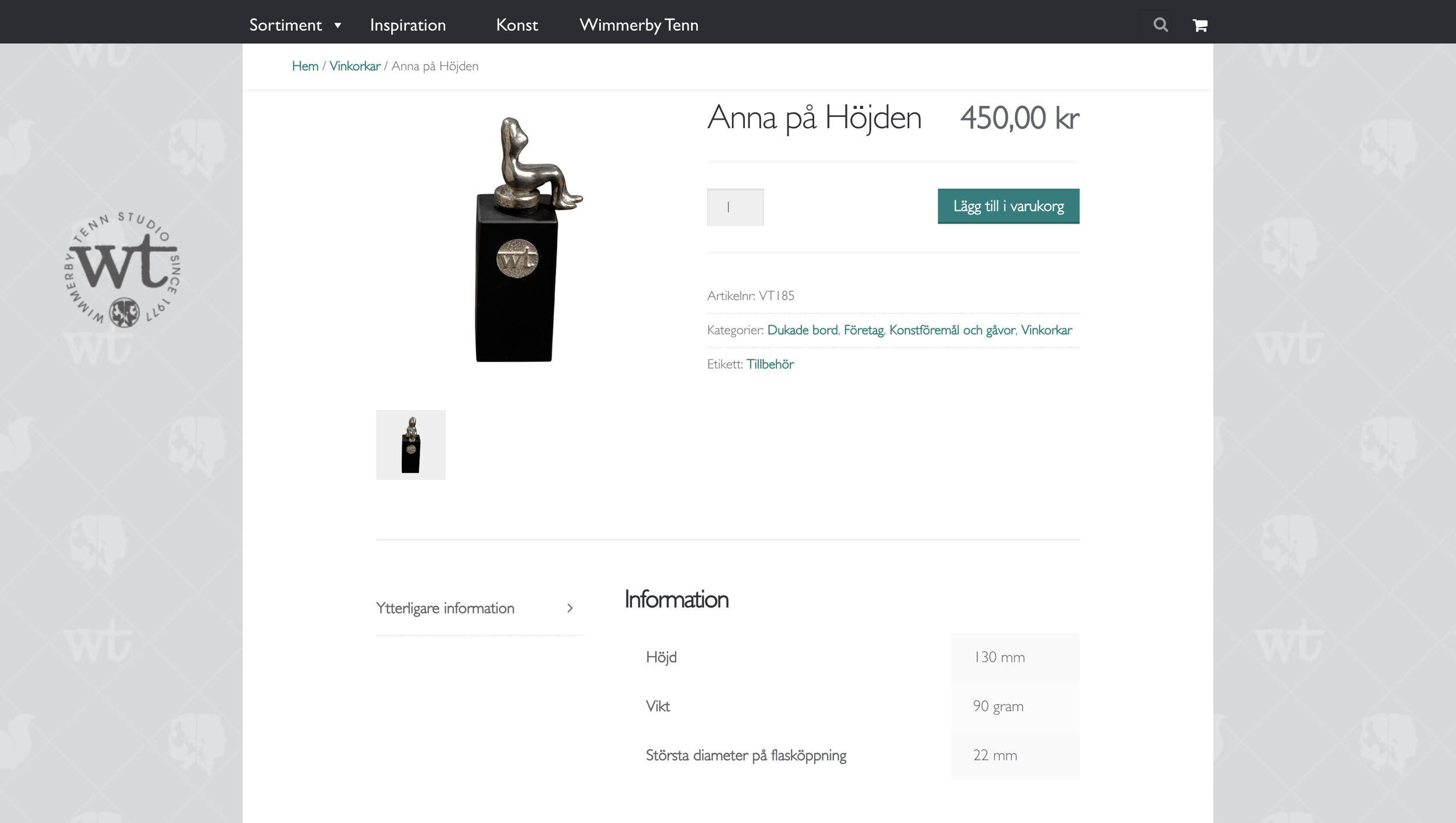
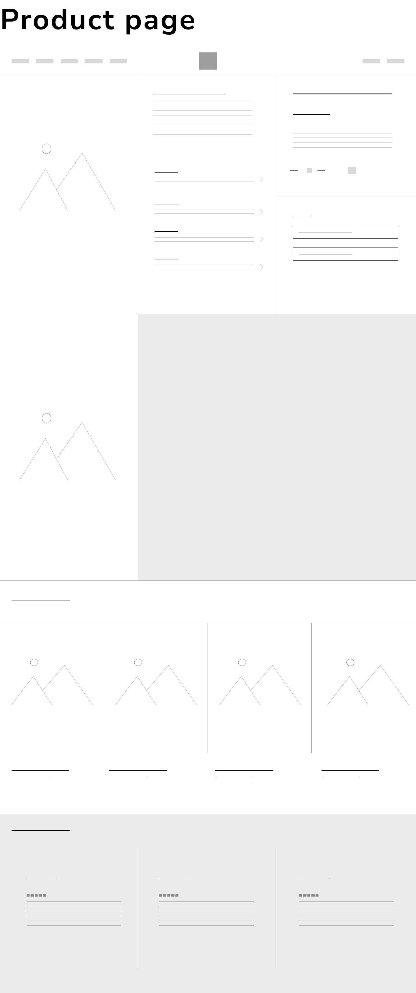
Product page
Focusing on detailed product info (material, size, designer etc).
Implemented vertical scrolling for product images without compromising product information space.
Combined lifestyle and minimalist product imagery to showcase design details and contextual use.
Checkout
Clear checkout with step-by-step wizard to guide users and reduce uncertainty.
Inline quantity editing and remove option to improve error recovery and reduce friction.
Added "You may also like" section to encourage upselling and increase average order value.
Booking page
Service design-driven booking feature allowing users to select available time slots, encouraging in-store visits and enhancing the overall customer journey.
Bookable in-store visits to build trust and loyalty through personalized, high-touch service.
Project reflection
More attention to the very start
I’m used to working under tight deadlines, which often makes me rush the concept phase. In this case we were eager to start the mockup phase. It resulted in missed opportunities to analyse ideas more deeply when we did have time for it. I would have spent more time on brainstorming, even involving users early by including them in the initial ideation phase.
Validate final design
Since this was a school project, our proposal was only a UX/UI suggestion for improving WimmerbyTenn’s website. I would have liked to continue research after publishing the design. If launched live, I would dive deeper into the user journey through user interviews, A/B tests, heatmap analysis, and conversion tracking to better evaluate if our design solved the identified problems.
Thanks for watching!
Discover my other projects here
Strategic UX and brand design to drive customer growth

Intuitive UX design for sustainable clothing recycling

Simplifying student finance management
Let’s create something meaningful together!
Lets's connect. Reach out through any of the channels below.