

Strategic UX and brand design to drive customer growth
My role : UX/UI designer
Project type : E-commerce
Team : 1 UX/UI designer, 1 web designer, 1 SEO manager
Status : Launched project
Tools : Figma, WordPress
Project overview
Background : ByRadhe is one of the biggest and most popular hair salons in Kalmar. They have a good reputation due to their high reviews and returning customers. ByRadhe always aims to give an exceptional experience for their customers. They also sell high-end products such as Kérastase.
Problem : The old website failed to highlight both of their saloons, lacked key information and didn’t reflect the brand’s luxurious feel. Poor readability and usability risked confusing users and losing potential clients.
Solution : The redesigned website offers a smoother user experience with simplified booking, clearer information, and a more luxurious visual feel. Key improvements include visible saloon locations, always-accessible booking CTAs, a luxurious visual identity and added staff info to guide new customers.
The challenge
The design lacked a luxurious and welcoming feel.
Small text and low contrast made the website hard to read and navigate.
Key details like staff, services, and hours were not easily accessible.
Both saloons weren’t clearly shown, causing confusion and risking missed bookings.
Selection of old design


Client’s vision and needs
To develop a new design for ByRahde, we began with a kick-off meeting where the client shared their goals, vision, and expectations for the project. Based on that discussion, their key priorities were:
Creating a more luxurious and trustworthy website experience
Emphasizing that they operate two distinct saloons, each with its own unique approach
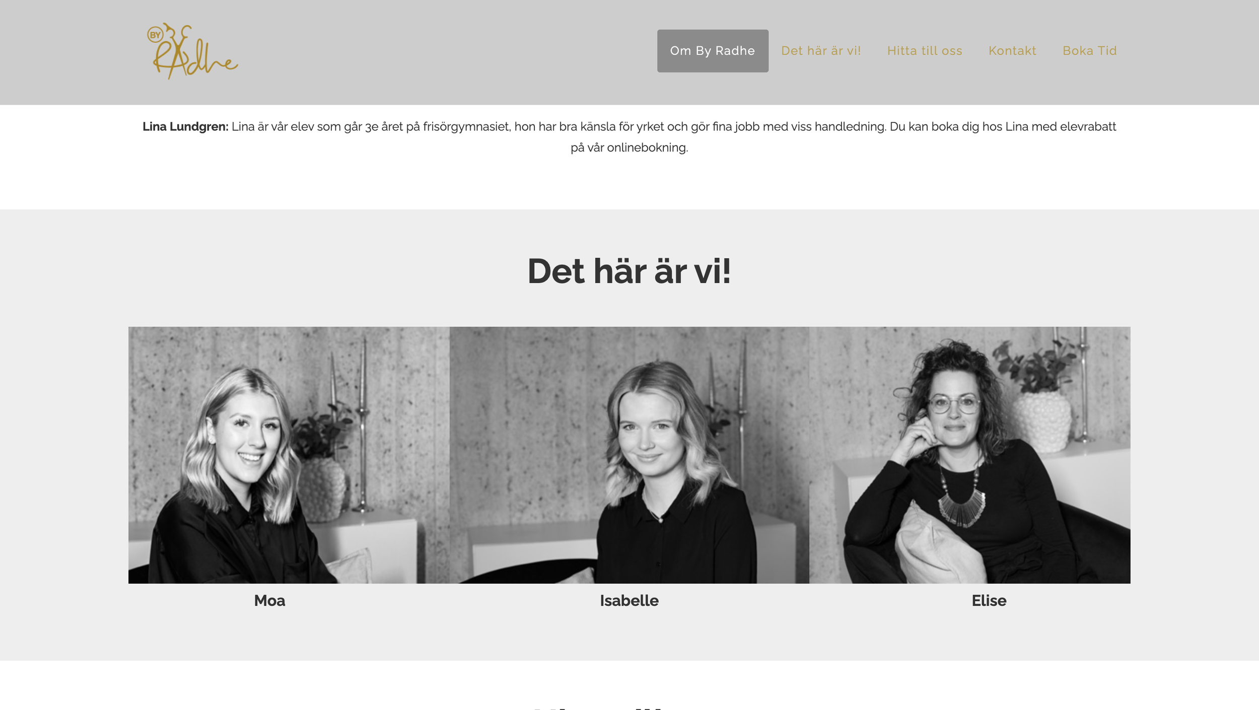
Adding a personal, family-oriented touch by showcasing each hairdresser and their expertise, helping visitors find the right match
Clearly presenting their services directly on the site, without requiring users to click the booking button first
Highlighting their range of Kérastase products
Iteration, iteration and more iteration
Later on, we created multiple wireframes to try out different colors and layouts to show to the client.
Trying out different colours
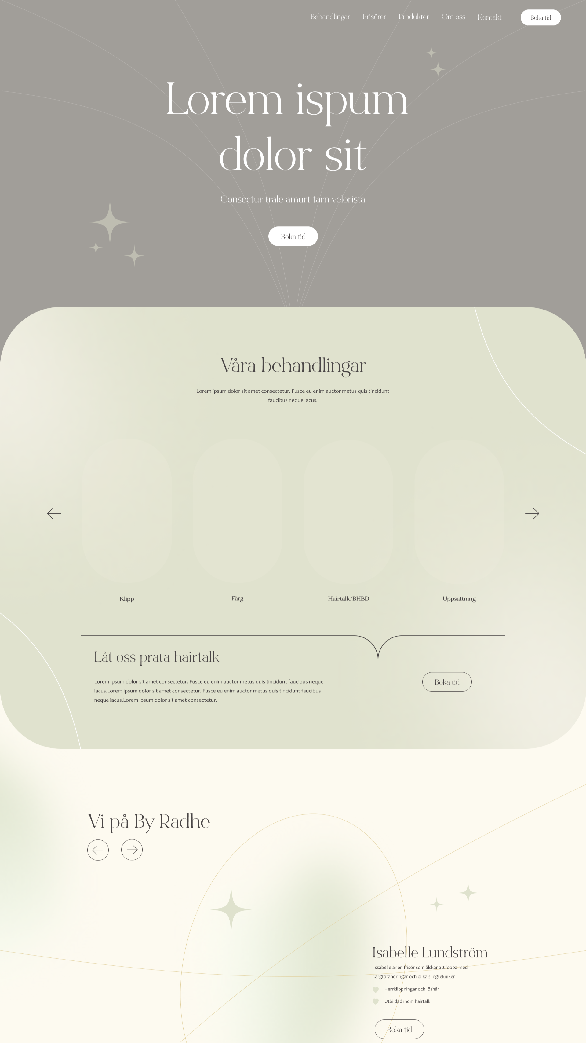
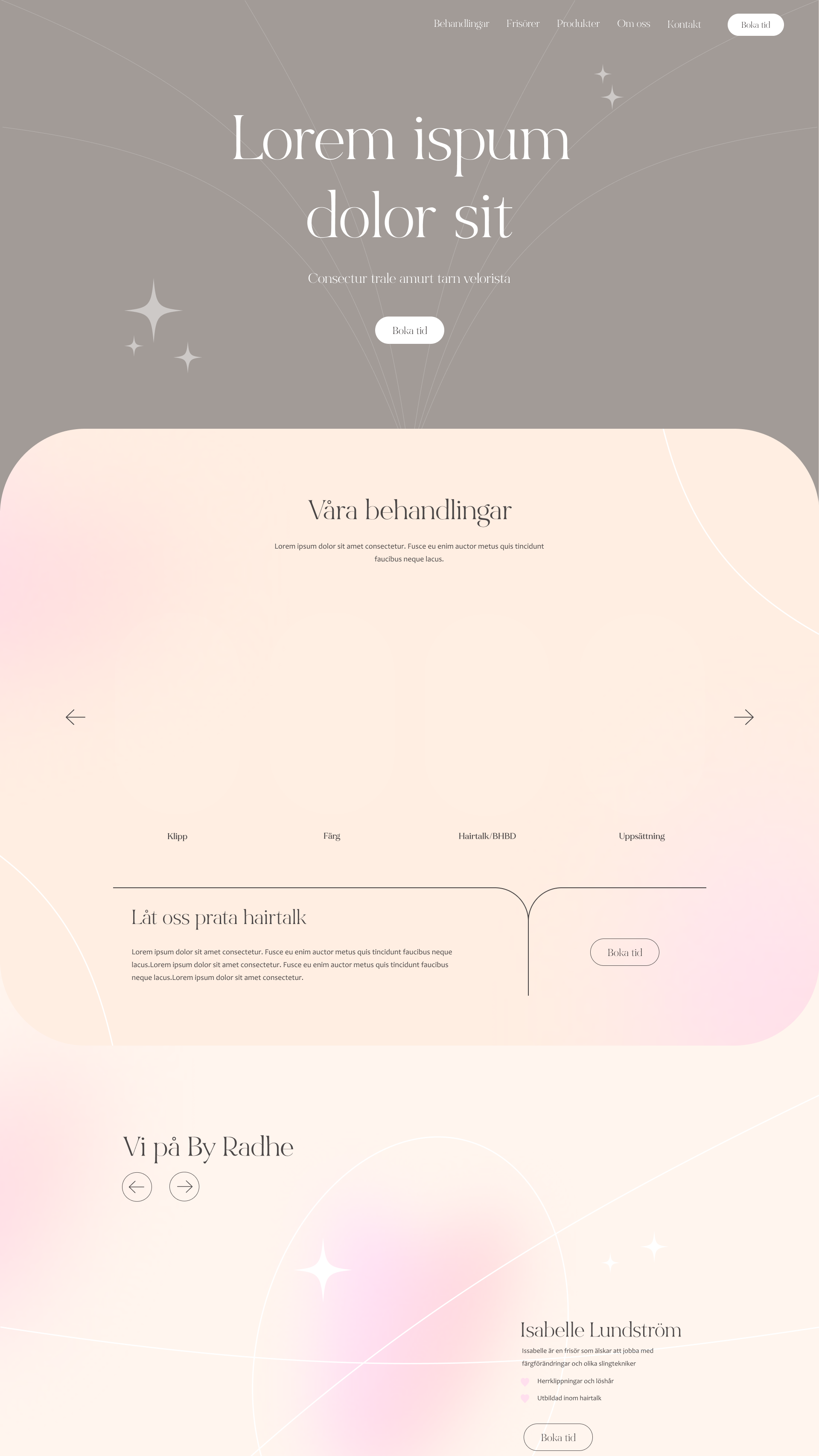

Trying out different layouts


Follow-up meeting with client
After presenting various wireframes, we held a follow-up meeting to determine the design direction they wanted us to pursue. The client expressed that we had captured their vision well and felt that the beige color reflected their idea of a luxurious feel in the best possible way.
In addition to discussing colors, we also focused on the importance of content hierarchy. The client shared what they considered most important, which led us to create a structured hierarchy for how the landing page should be organized.
Information hierarchy
To clarify the importance and structure of the content on the landing page, we collaborated closely with the client to create a clear and simple user journey. This allowed us to highlight the sections they considered the most important.
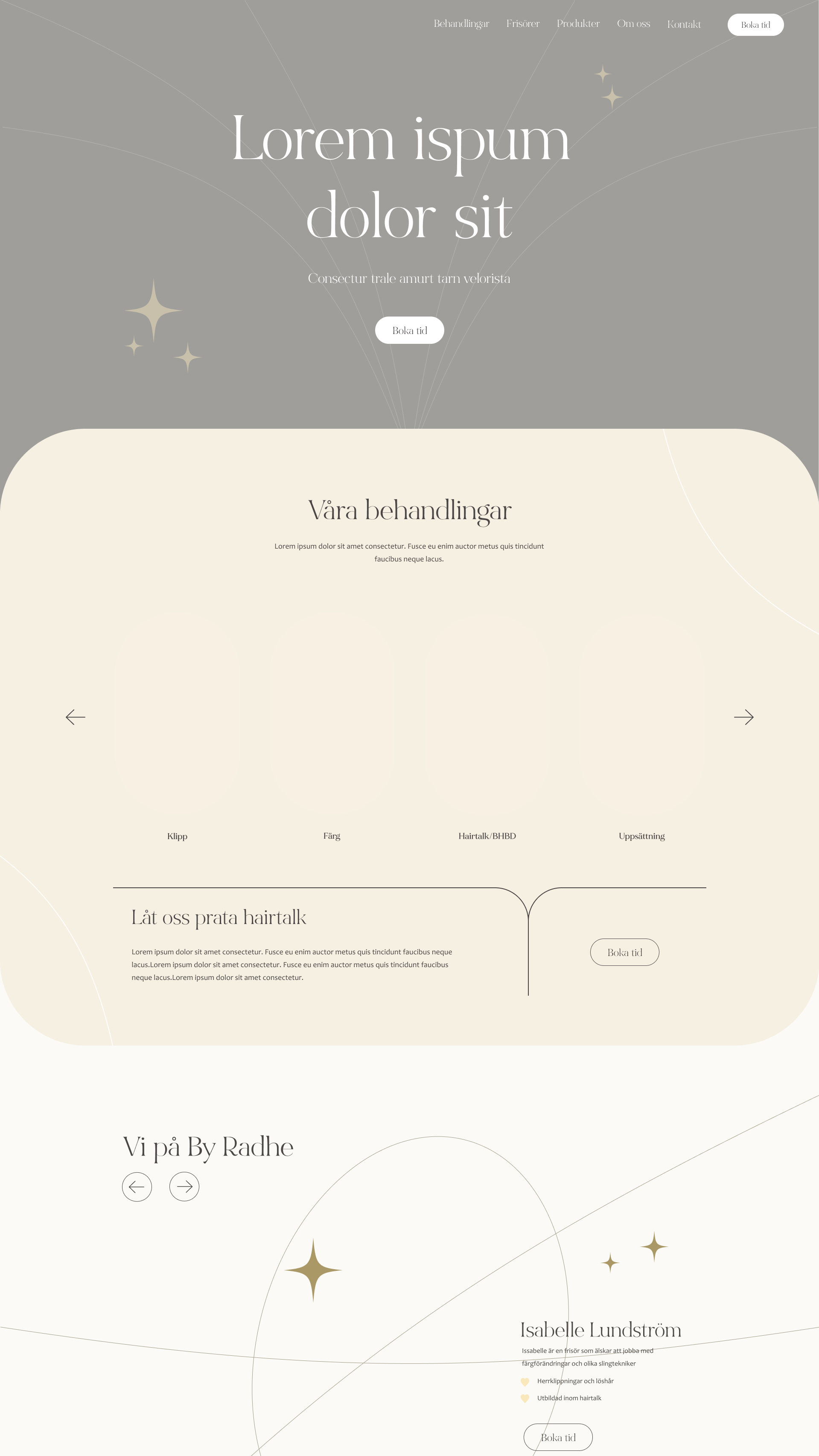
Welcoming hero image of the team with a clear booking CTA
Highlight both saloon locations
Introduce the team and their areas of expertise
Present their range of services
Include product information about Kérastase
Showcase the brands they offer in their saloons
Integrate their Instagram feed with images
Emphasize the two salons again further down the page
Footer with all subpages and an additional booking CTA
Result
After finalizing the landing page with the approved colors and content structure, it was sent to the client. Once approved, we moved on to designing the subpages.
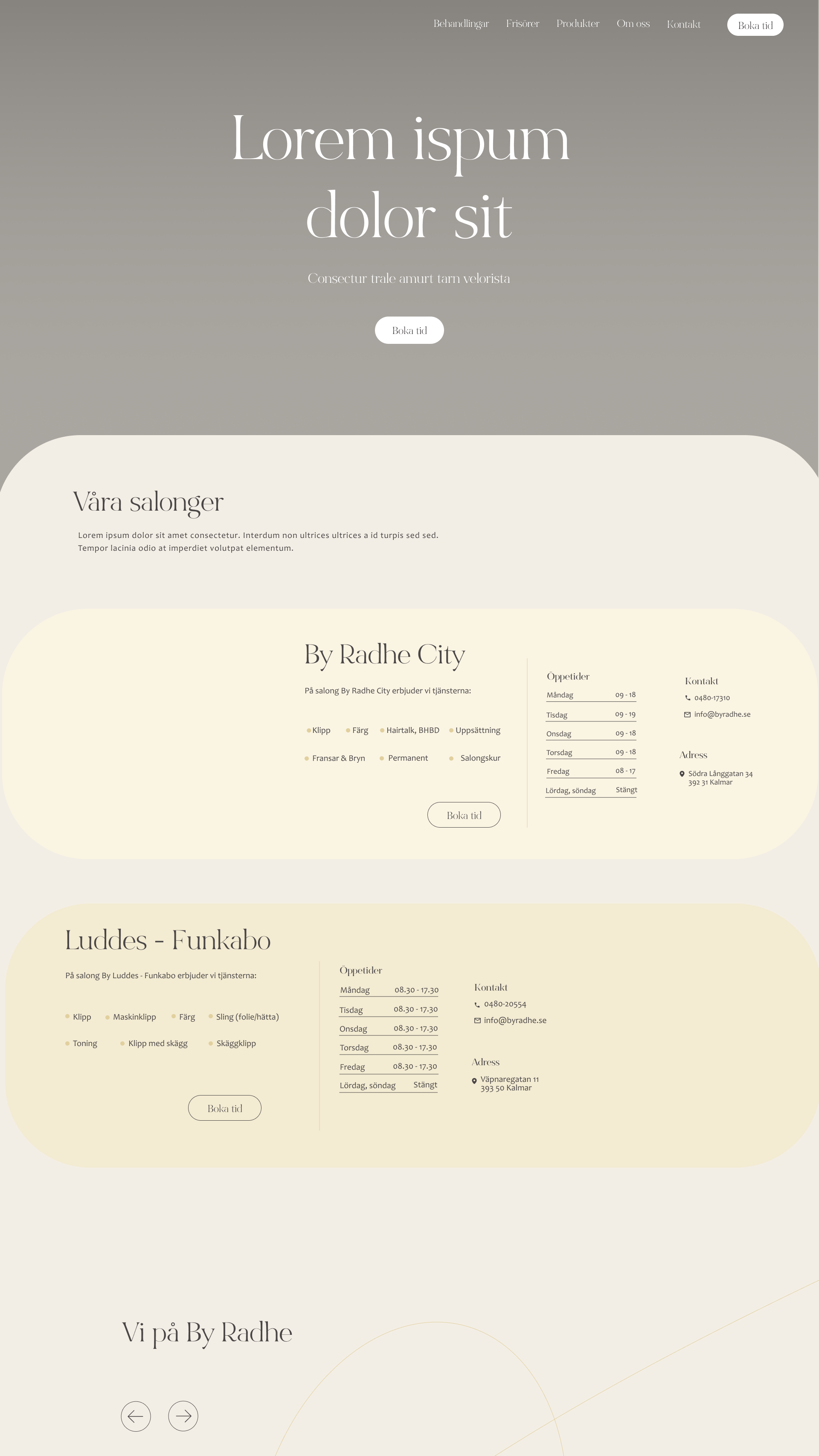
Landing page
Both salons clearly presented
Luxurious and welcoming feel
Improved text contrast
Clear display of services in both the page flow and navigation bar
Includes more content, such as team introductions, brand highlights, and salon details
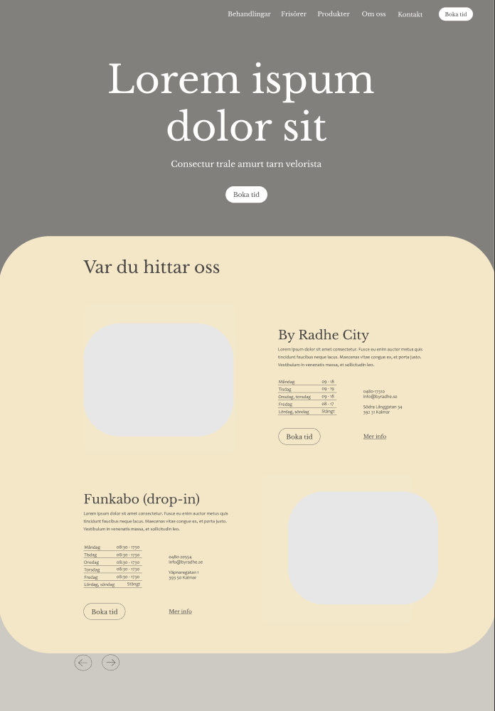
Services
Displays all available services, emphasizing their ability to meet every customer's needs while maintaining a high-end, luxurious feel
Clear CTA for booking appointments
Includes opening hours and addresses for both saloons
Reflection of project
Inquisitive about needs
I could have been more inquisitive about the client’s needs, such as asking what a "luxurious feel" meant to them. Detailed questions might have shortened the design process and reduced iterations. This insight has guided my approach in later projects to better match the client's vision.
Incorporate more UX design
Additionally, the project did unfortunately not involve any UX research practises. If I had the chance to implement more UX I would have conducted user research (interviews) to implement design proposals based on actual user needs. Furthermore I would have wanted to do user testing on prototypes with follow-up interviews to ensure that the design met their needs in the best possible way.
Thanks for watching!
Discover my other projects here
B2C E-commerce redesign for a premium interior brand

Intuitive UX design for sustainable clothing recycling

Simplifying student finance management
Let’s create something meaningful together!
Lets's connect. Reach out through any of the channels below.