


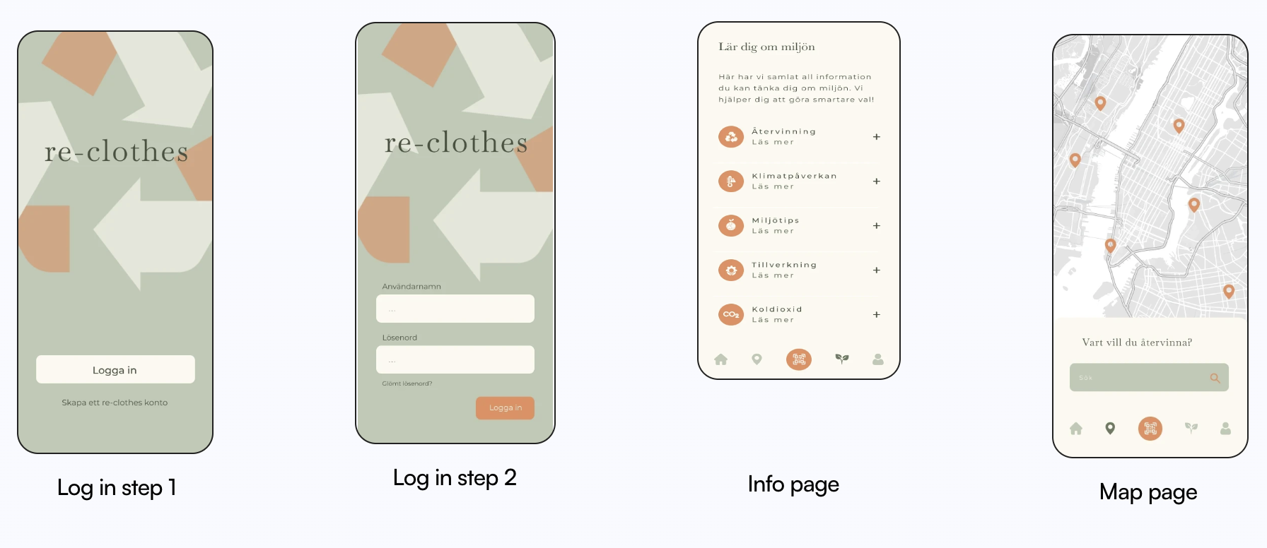
Intuitive UX design for sustainable clothing recycling
My role : UX/UI designer
Project type : App design
Team : 4 UX/UI design students
Status : Student project
Tools : Figma
Project overview
Background : The project focuses on raising awareness of the fashion industry's environmental impact. By reducing our ecological footprint, we contribute to a more sustainable future.
Problem : Users lack clear guidance and motivation to reduce waste and recycle, making it hard to understand their impact on the environment. There's a need for solutions that encourage sustainable habits and reduce ecological footprints.
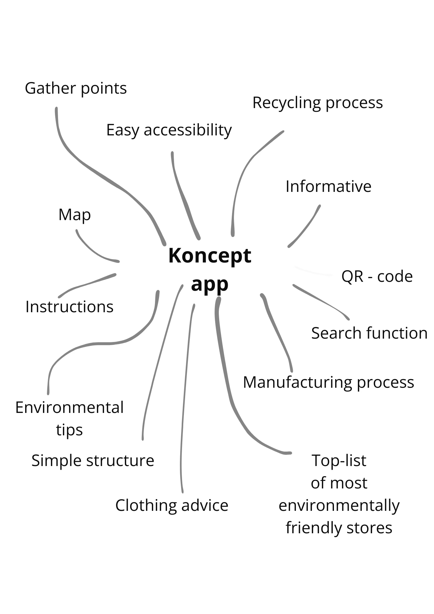
Solution : The solution combines QR scanning, recycling info, eco-brand highlights and care tips to guide users toward sustainable clothing habits, making it easy, rewarding, and informative.
The challenge
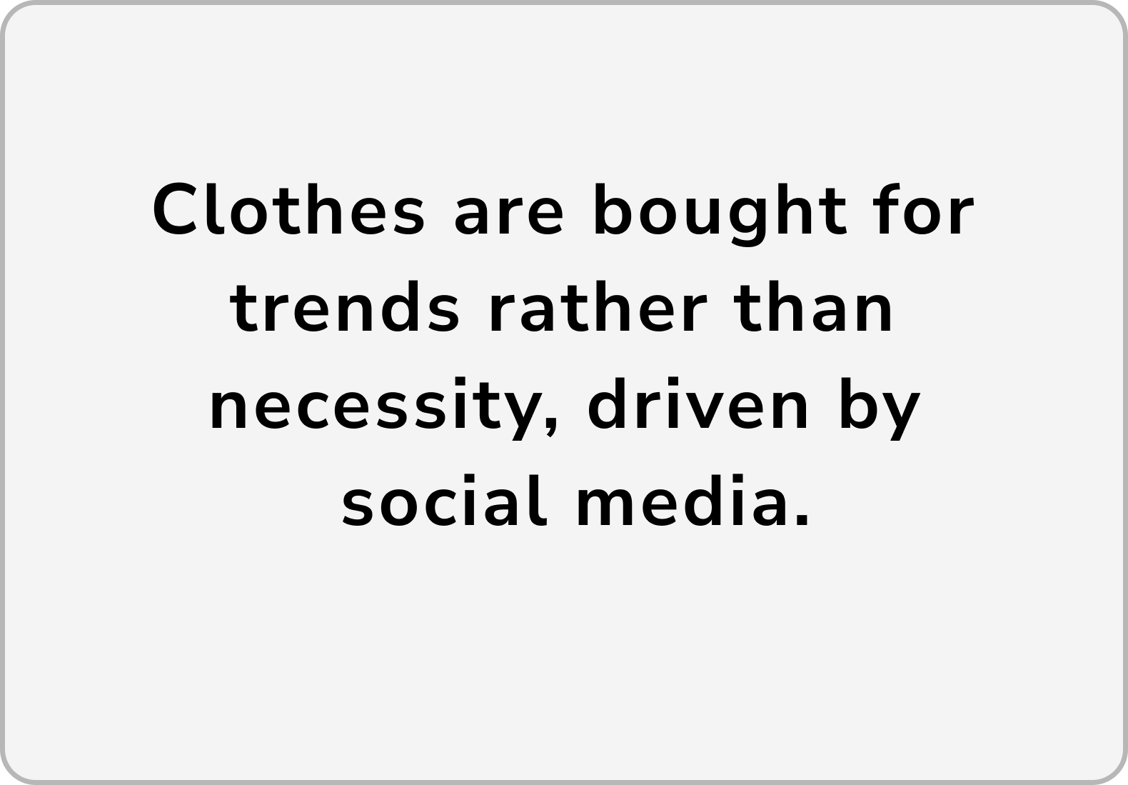
Users buy clothes based on trends, heavily influenced by ads and social media often overlooking sustainability.
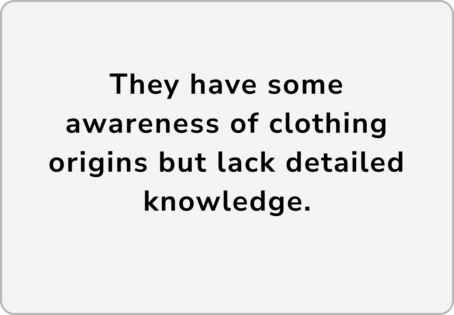
Users express a strong interest in learning more about the production and lifecycle of their clothing.
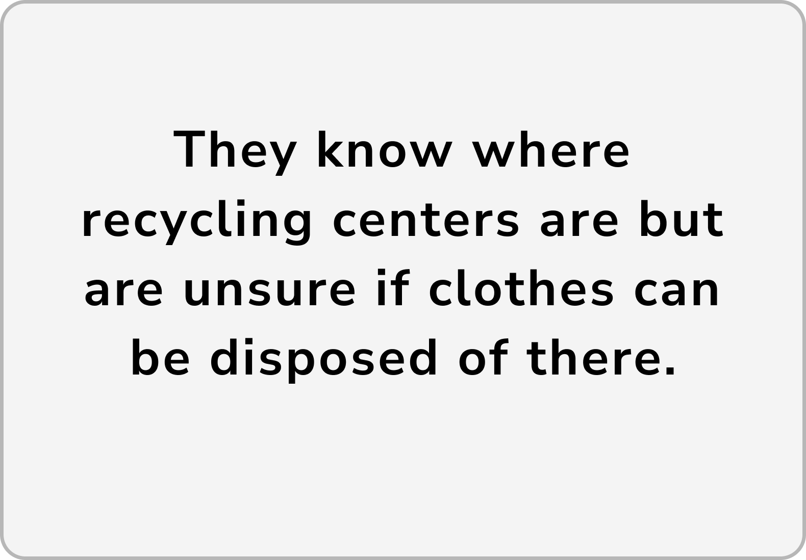
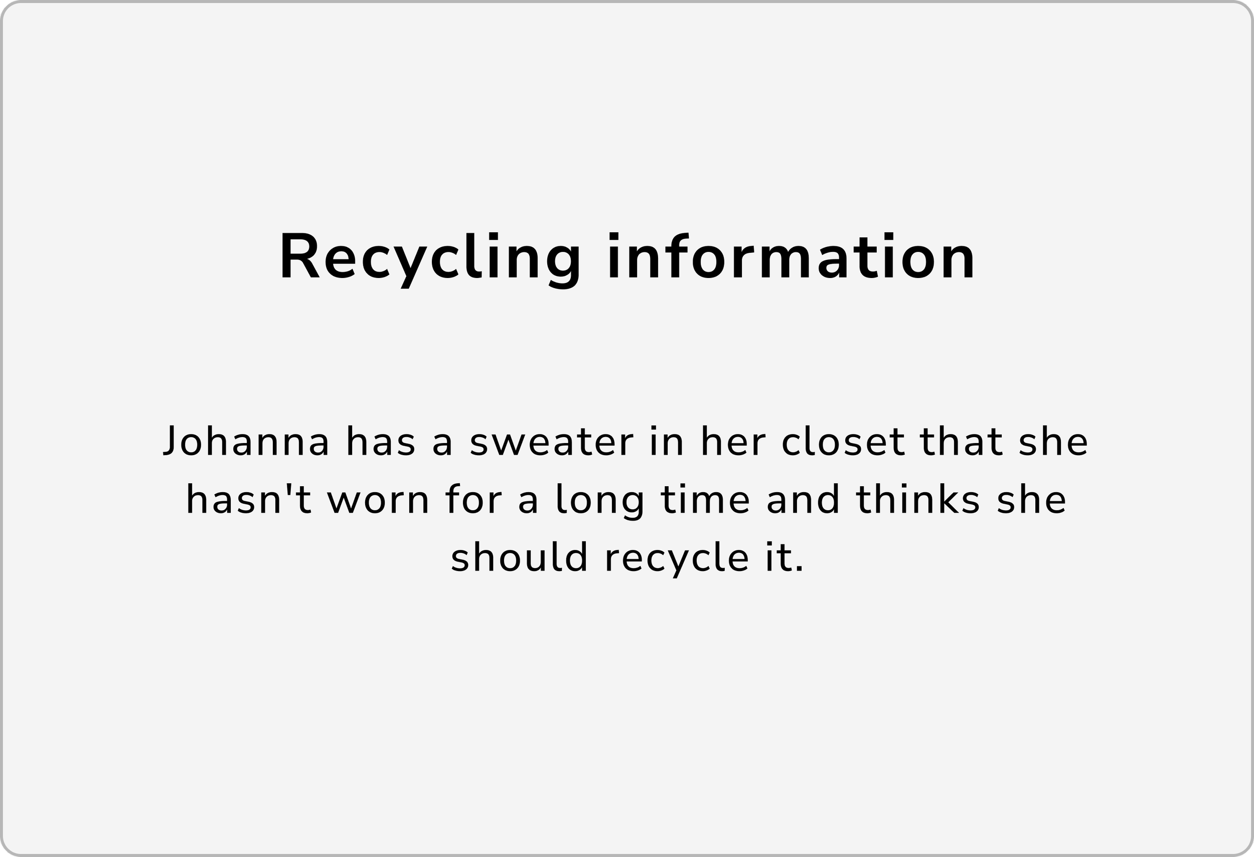
Though aware of recycling centers, users are uncertain if and how clothes can be recycled there.
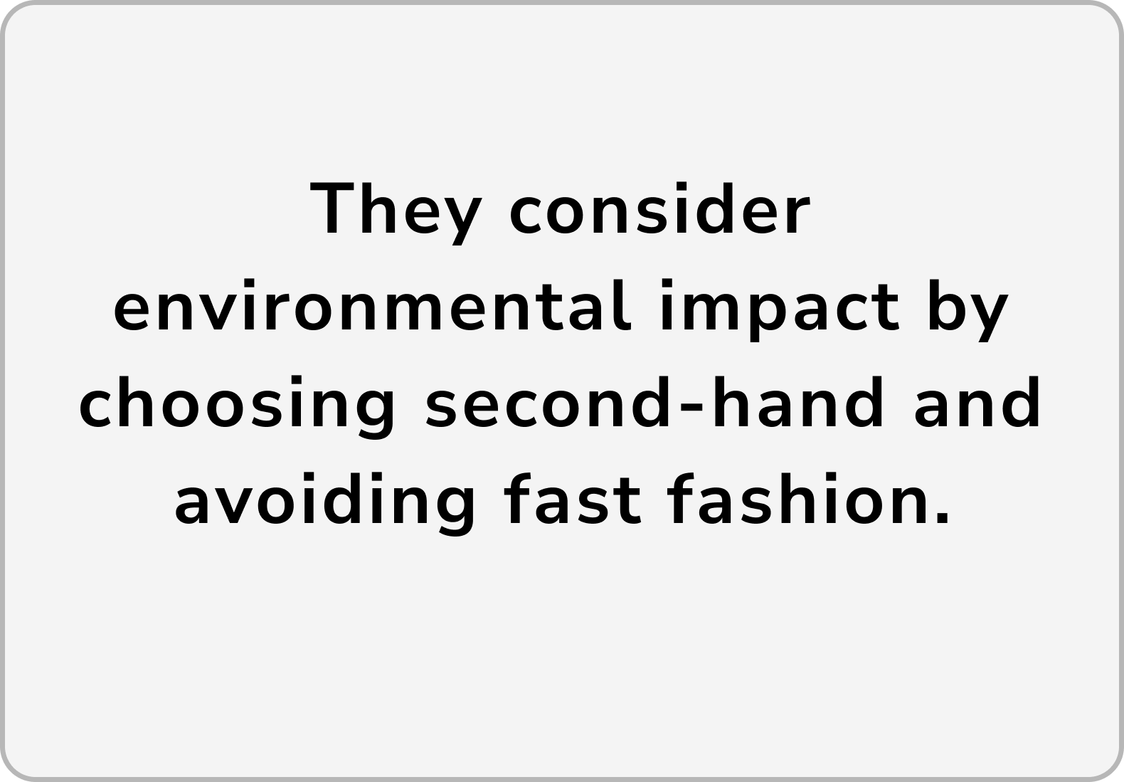
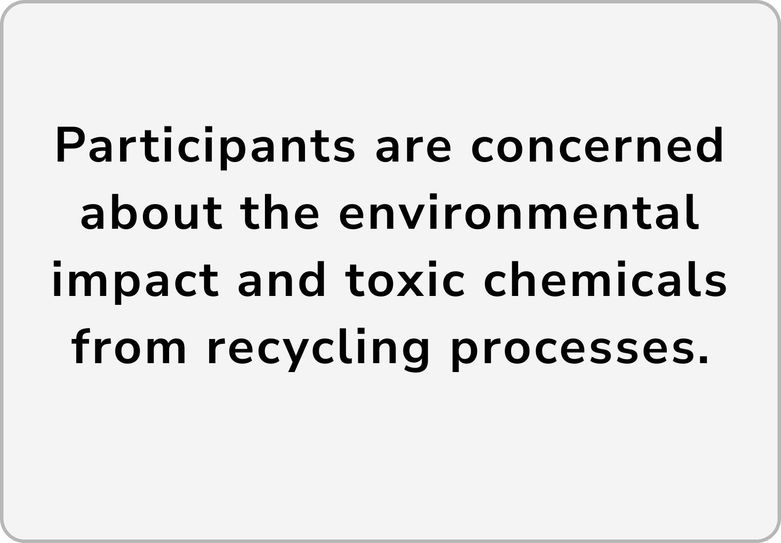
Participants worry about the environmental impact and chemical use in current recycling processes.
Design process
This category details the step-by-step approach taken during the project.
User study
We started by interviewing users about their shopping habits, sustainability awareness, and what they really know about where their clothes come from and where they end up.
Creating a persona
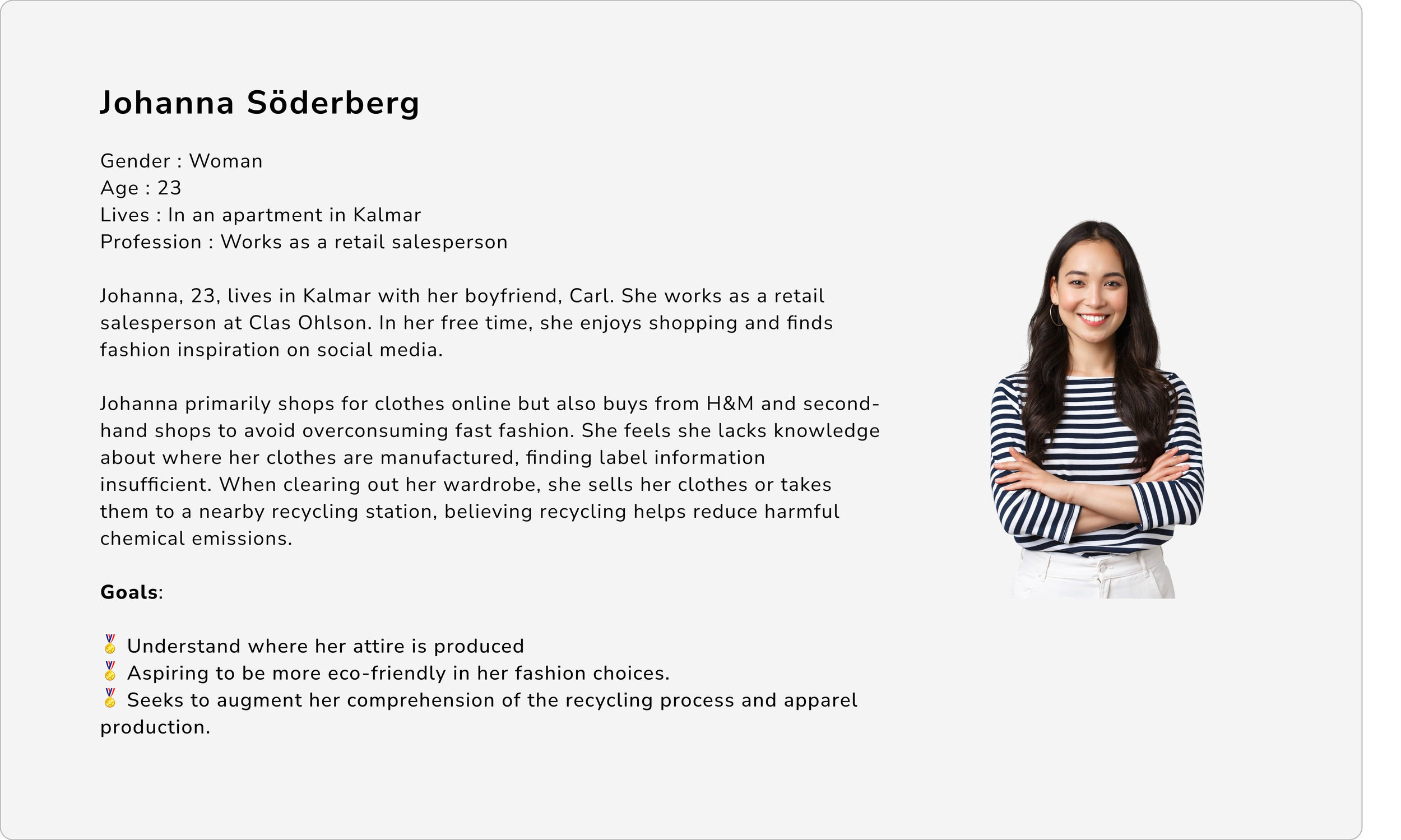
To gain deeper insight into how a typical user might experience the problem, a persona was created.
Brainstorm
Later on a brainstorming session was held to generate multiple ideas for the project's application.
Interviews
A follow-up interview was conducted to give participants a deeper understanding of the project and to generate additional and new perspectives. The users were asked questions about functionality, content and interface.


Requirements
After the interview, requirements for functionality and data were made. Each requirement was then paired with a scenario based on the project's persona to help with the design process and visualize the user.
Functional requirements
Data requirements

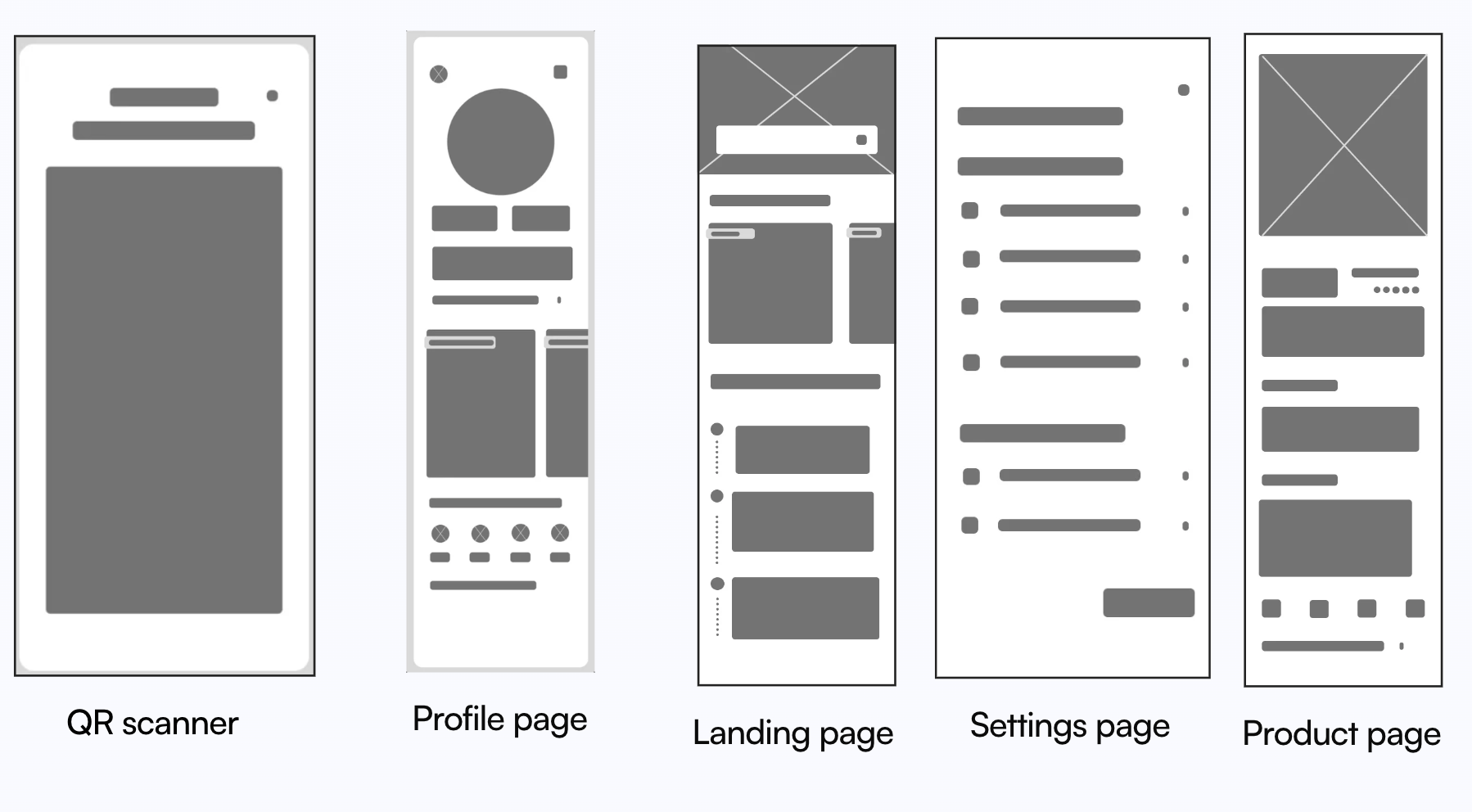
Wireframes
Later on, wireframes were created to test how all the collected information could be presented in the app.

High-fidelity prototype
Once the wireframes were completed, we added interactivity to simulate how the implemented design would function if it was launched.

User testing
User testing was then conducted with the project's users. The purpose was to let them test the app's primary features in order to evaluate both positive and negative experiences during use. The test included the following tasks:
You are at home and have collected clothes for recycling, but you don't know where the nearest recycling is located.
You are in a clothing store and have found a sweater you like, but it has no information about where it was made.
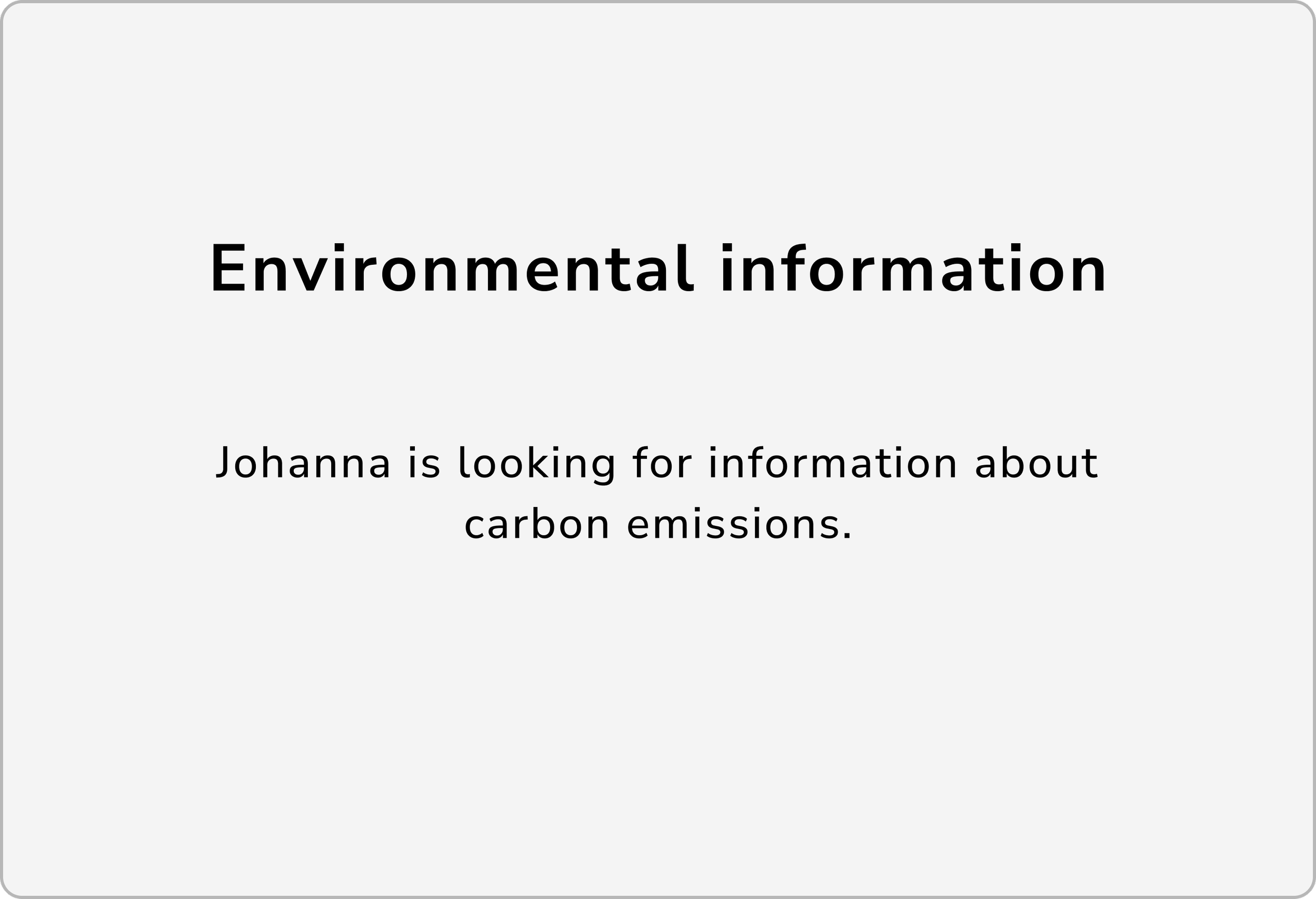
You are looking for information about carbon emissions.
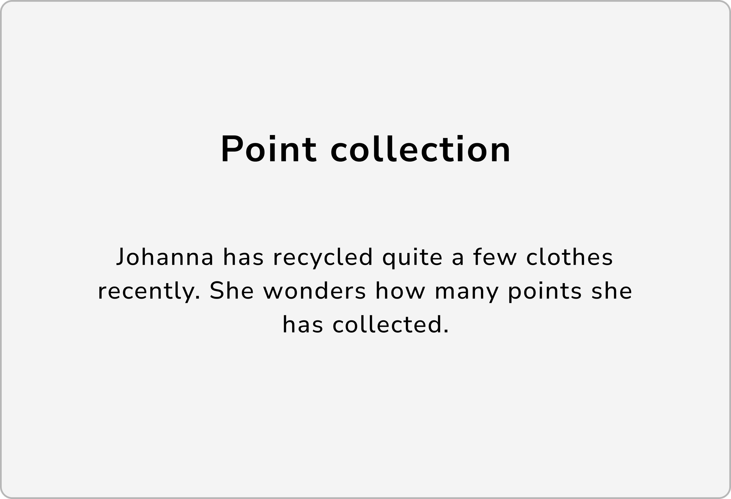
You have recycled quite a few items recently and wonder how many points you have accumulated.
You feel you don't have a good understanding of how the clothing industry affects the environment.
Result of user testing
After testing the high-fi prototype the participants pointed out following :
Participants were confused by the settings icon with a filter icon. Two participants attempted to log out by clicking on their profile picture instead.
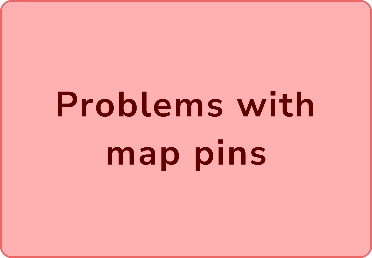
Participants had trouble understanding that they needed to click on pins to view information about opening hours and became frustrated when they had to click multiple pins to find one with late hours.
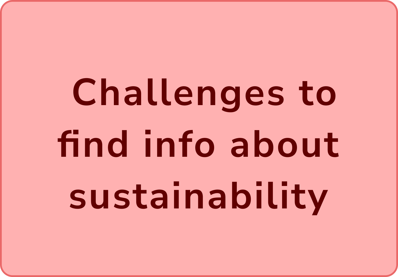
Participants struggled to find information on sustainability info and needed guidance or explored various pages before locating the information.

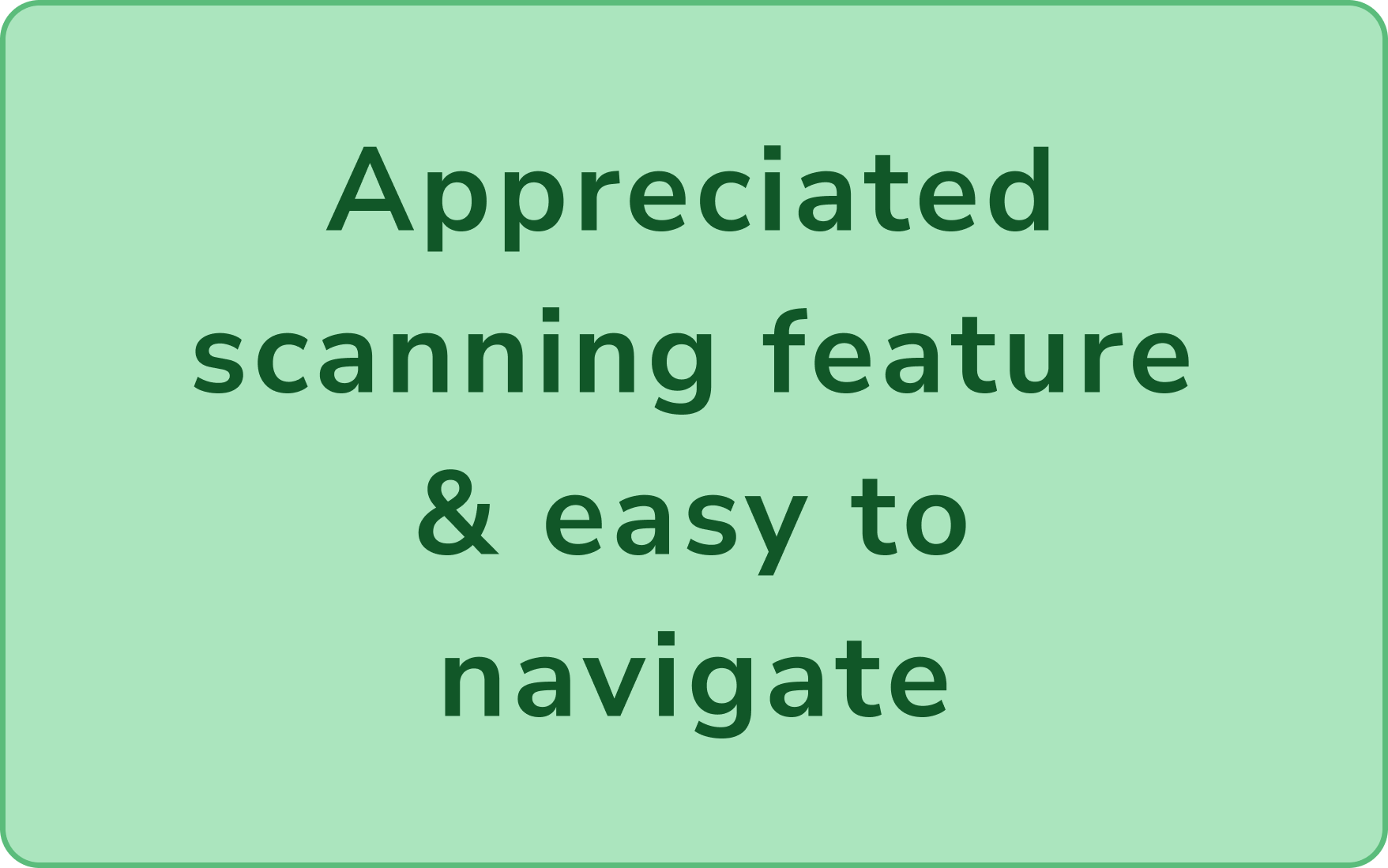
Participants enjoyed the scanning feature and pointed out how easy it was to use.
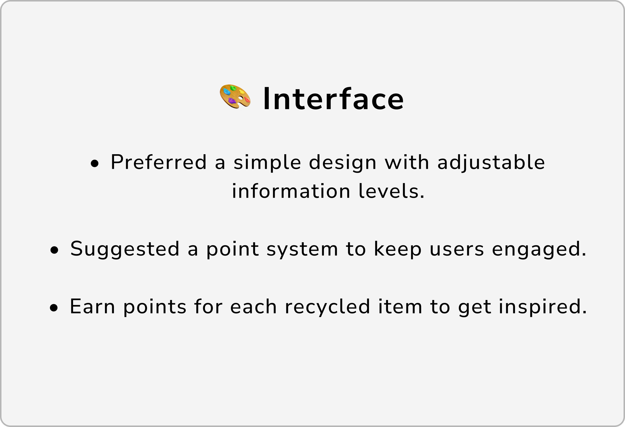
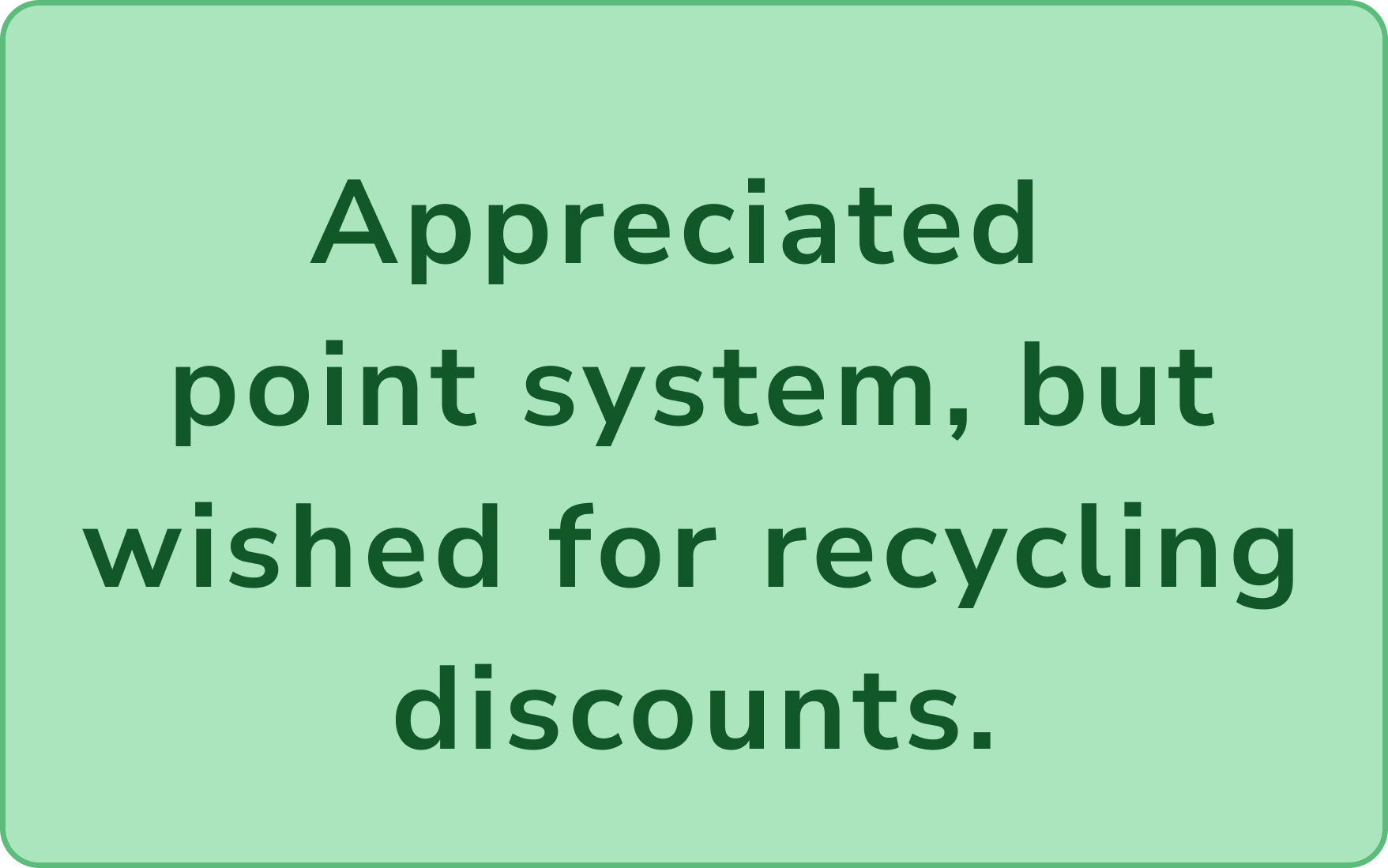
Enjoyed collecting points, but lacked real-life benefits to stay motivated to recycle.
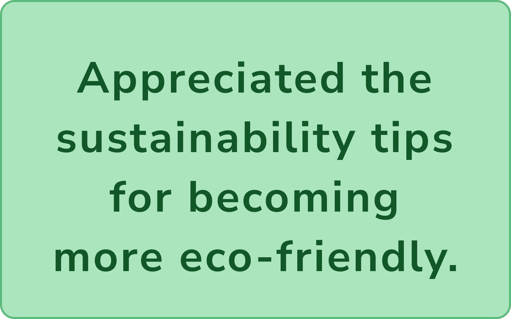
Appreciated the concise guidance on living more sustainably on homepage
Result
After finalizing the landing page with the approved colors and content structure, it was sent to the client. Once approved, we moved on to designing the subpages.
QR-scanning : lets users instantly access sustainability details by scanning a garment’s tag in-store. It’s a seamless feature that builds trust, supports conscious choices and delivers the right information at the right moment.

Sustainability info : Highlighting sustainable brands on the homepage along with simple everyday tips empowers users to make conscious choices and explore ethical companies from the very first click.
Certainty in recycling: An interactive map helped the users find the right recycling center for their needs, making sustainable choices simple and clear.
Easy access to sustainability insights : A clear dropdown menu makes it easy to explore sustainability topics like production, eco tips, and recycling.
Motivating Recycling : A points system motivates users to recycle more instead of tossing waste. Clear stats show each user’s impact, plus a social feature lets them compare recycling levels with friends.
Clear Info trough QR scanning : Washing tips, origin, and a sustainability rating help users care for clothes and shop smarter with clear info on materials and emissions.
Reflection of project
More user iterations
Participants had difficulties understanding some icons and navigating certain features, such as finding information on sustainable brands and using map pins. To make the app more user-friendly, another design iteration would be needed to address these issues
Thanks for watching!
Discover my other projects here
B2C E-commerce redesign for a premium interior brand
Strategic UX and brand design to drive customer growth

Simplifying student finance management
Let’s create something meaningful together!
Lets's connect. Reach out through any of the channels below.